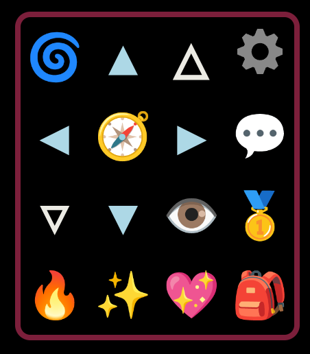
Typing out the same short, frequently entered game commands on a physical keyboard is a common facet of most MUD games, but is one that can quickly become tedious on a mobile device. LociTerm provides on-screen touch menus that are intended to make gameplay easier on mobile devices.
LociTerm Pre-Defined Menus
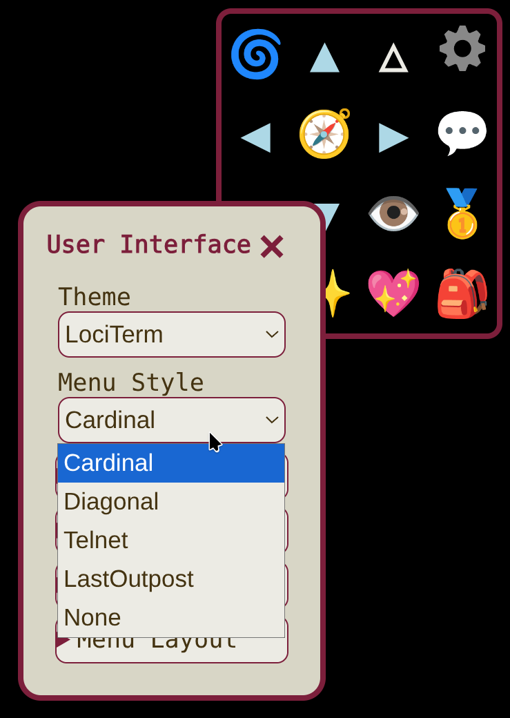
LociTerm offers several different menu styles under the User Interface tab. The default menu, "Cardinal" is optimized for playing Diku-style games like The Last Outpost, where the game uses NESWUD directions. The "Diagonal" menu is better suited for LP-style games where there are additional NE,SE,SW,NW directions available to the player. The player is free to choose the pre-defined menu style that suits them best.
However, there is another option for games wishing to provide their own menus to players! The Loci.Menu GMCP module provides a way for a game to send custom menu definitions to any MUD client that supports the protocol.
This page covers the configuration options that the Loci.Menu system provides, and a brief tutorial for creating custom menus. For information on to implement the protocol itself, see the Loci.Menu GMCP protocol docs .
Loci.Menu Server Side Configuration
A Loci.Menu definition is written in JavaScript Object Notation (JSON) format, and is sent to the client from the server by the GMCP protocol. JSON files are finicky things full of commas, brackets, quotes, and colons that all have to be in the right place for everything to work. If you have a JSON file editor, it would be wise to use it while developing a new menu definition! If you don't have a fancy JSON editor, don't worry about it. Any old text editor will do just fine as long as you are careful with it.
The Name, the Menubox, and the Menubar
- A name and label for identifying the menu style to the client and the player.
- A single "menubox" containing touch buttons that are always available on screen.
- One or more "menubar" menus that pop up a shorter list of options in response to hitting a button.
Your first Loci.Menu
First things first, to make an 'empty' Loci.Menu, we need to provide at
least an internal name and a label for the menu. Clients use the name field
internally, and the label may or may not be shown to the player as part of a
style selection menu, so you have to provide them. Naming things is difficult,
but you might consider naming your menu the same as your game. For now, we'll
call our menu "Tutorial Menu". The JSON definition of the most basic of all
Loci.Menus looks like this:
{
    "name": "tutorial",
    "label": "Tutorial Menu"
}
Adding a Button to the Menubox
An empty menu by itself isn't that interesting, and one is in fact already
included in LociTerm under the name "None" for those who don't wish to be
distracted by a lot of buttons. However, we, doing this tutorial, would relish
the distraction. Writing "Hello World!" is a long standing tradition in
programming, so we'll add that as our first custom button. To do so, we'll
define a "menubox" that contains a JSON array named "buttons" that will hold
our button definitions. We'll make a button that sends a command to the game
when it is pressed. It looks like this:
{
    "name": "tutorial",
    "label": "Tutorial Menu",
    "menubox": {
        "buttons": [
            {
                "name": "hello",
                "text": "Hi!",
                "send": "say Hello World!\n",
            }
        ]
    }
}
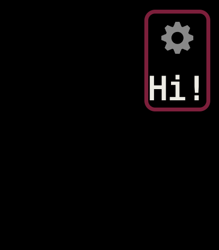
First notice that the button has to have a "name". Yes, naming things is difficult, but don't skip giving the button a descriptive name! It is what will be read to the player if they are using a screen reader, so try to give it a name that is short and that labels its function. Naming it "Button #1" is better than nothing, but "hello" is a better choice here.
The "send" item tells the client that it should send the listed text when
the player hits the button. Note that there is a \n to indicate
that the client should also send a newline character at the end. Button "send"
text is allowed to have multiple newlines, just include the \n
where you need them. In this example, pushing the button sends the command
"say Hello World!" directly to the game. Try it!
The simplest buttons can be made out of letters with the "text" item. If you are using actual letters and words, you'll want to keep the text short, since square buttons fit best in the menubox. Buttons don't have to be words though, as we're about to see.
Emoji and Images as Buttons
Most of the stock menus in LociTerm make use of "Emoji Buttons", which are fast and easy to configure, and don't require an external web server to provide downloadable images to the client. Since Emoji are just text characters, they can be included directly in the "text" option.
Something to note about Emoji is that an Emoji may look different on your editor screen than it does in a web browser, and it may look different still on other systems. The exact look of an Emoji depends on the fonts that the player has on their system, including whether Emoji print in multiple colors, or in monochrome. To give monochrome text buttons some color, we can suggest a foreground and background color with the "color" and "background" options. These take standard web format colors.
Buttons can also be made from an image stored on a web server with the "img" option, and a standard image URL. The image will be downloaded by the client, and scaled to the user's button size. Note that the image MUST come from a secure https:// location, and not a plain, unencrypted http:// server. Most web browsers and many MUD clients, including LociTerm, will not allow "mixed content" downloads for reasons of security. If the image can't be downloaded, a client may use a placeholder image instead, so it is important to make sure the server with the image is running https.
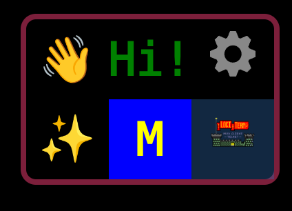
Lets add a little pop of color to our first button, and add two new buttons to
test the different types.
{
    "name": "tutorial",
    "label": "Tutorial Menu",
    "menubox": {
        "buttons": [
            {
                "name": "hello",
                "text": "Hi!",
                "color": "green",
                "send": "say Hello World!\n"
            },
            {
                "name": "wave hello",
                "text": "👋",
                "color": "red",
                "send": "wave\n"
            },
            {
                "name": "custom castle",
                "img": "https://lociterm.com/home/common/lociterm512x512.png",
                "background": "#2f6aac60",
                "send": "shout I like LociTerm!\n"
            }
        ]
    }
}
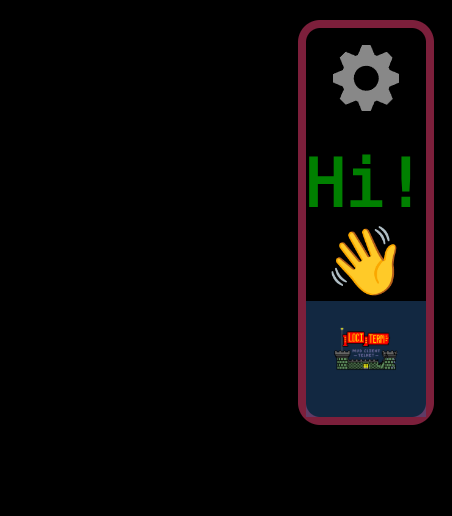
Notice that in the screenshot, the waving hand Emoji is rendered in a full-color font, and looks yellow. The color font overrides the "color":"red" hint that we provided. If the waving hand had been a monochrome font, it would have printed in red.
Adding Menu Buttons
The menubox is starting to look pretty fancy, but there is something missing. So far, none of our buttons have opened any sub menus. The Loci.Menu protocol strongly suggests that you provide access to the player's "Hotkey Menu" from somewhere in the menubox, but leaves it up to you to place it.
We'll add that sys_hotkey menu and a custom menu button of our own next.
{
    "name": "tutorial",
    "label": "Tutorial Menu",
    "menubox": {
        "buttons": [
            {
                "name": "hello",
                "text": "Hi!",
                "color": "green",
                "send": "say Hello World!\n"
            },
            {
                "name": "wave hello",
                "text": "👋",
                "color": "red",
                "send": "wave\n"
            },
            {
                "name": "custom castle",
                "img": "https://lociterm.com/home/common/lociterm512x512.png",
                "background": "#2f6aac60",
                "send": "shout I like LociTerm!\n"
            },
            {
                "name": "test menu",
                "text": "M",
                "color": "yellow",
                "background": "blue",
                "menubar": "menu_mytest",
            },
            {
                "name": "Hotkey",
                "menubar": "sys_hotkey",
                "text": "✨",
                "color": "Yellow"
            }
        ]
    }
}
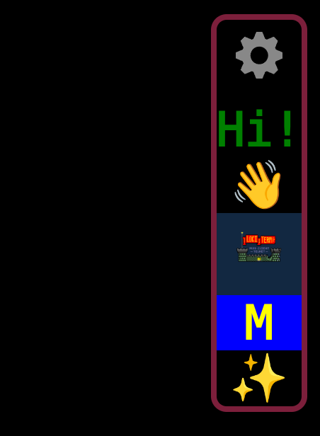
The "menubar" directive tells the client that it should open a new Loci.Menu menubar with the given name. The Loci.Menu protocol documentation has a set of predefined sys_* menus listed in it, one of which is the sys_hotkey menu. The LociTerm standard icon for the sys_hotkey menu is "✨", but you are welcome to use what you want there.
(Note- for more information on server programmable hotkeys, see the Loci.Hotkey GMCP Module protocol documentation.)
The menubar in our "test menu" button isn't defined yet, so that button won't do anything when you click it. We'll be using it later in the menubar part of this tutorial.
Controlling the Dimensions
Our menubox is looking pretty good, but it feels like it is getting a little oblong. By default, the buttons are placed in a single column. To get them into more of a box shape, you may specify "width" and "height" parameters that determine the size of the menubox.
Try adding a width and height just before the "buttons" definition, like this:
{
    "name": "tutorial",
    "label": "Tutorial Menu",
    "menubox": {
        "width": 3,
        "height": 2,
        "buttons": [
            …
        ]
    }
}
That's more of the box shape we were looking for! Take special note of how the buttons are placed into the box. The automatic gear menu button is always in the upper right hand corner, and you can't control its location. The rest of the buttons are placed into the menubox in the order that they appear in the "buttons":[] array inserting from right to left, until the "width" has been filled. They continue inserting on the next row down, starting from the right hand side, and again inserting right to left.
If there are more buttons than will fit in the combined width and height of the menubox, the height of the menubox will increase to accommodate the buttons. If there are fewer buttons than will fill in the provided width and height, the box stays at least as big as was configured, and will have blank spots.
Keep in mind that you can not control the size of the buttons themselves, and the player chooses how big the buttons should be from the "Button Size" setting. Touch screen buttons are typically "finger sized", or about 1cm. That means you should avoid making menus that are more than six or seven buttons wide, or you risk making the menubox too large to fit on the phone! Similarly, try to avoid a menu height of more than six or seven too.
What else is on the menu today?
Next up, we'll work on crafting some menubar pop up menus! But that'll be in the next tutorial.